
Matching or Contrasting Grout: How Grout Color Changes a Tile Design
Grout fills only a small part of a tiled surface, but it changes how the whole design reads. Before choosing a color, it helps to decide what you want people to notice: the tile, or the pattern the tile makes.
Matching grout: a quieter surface
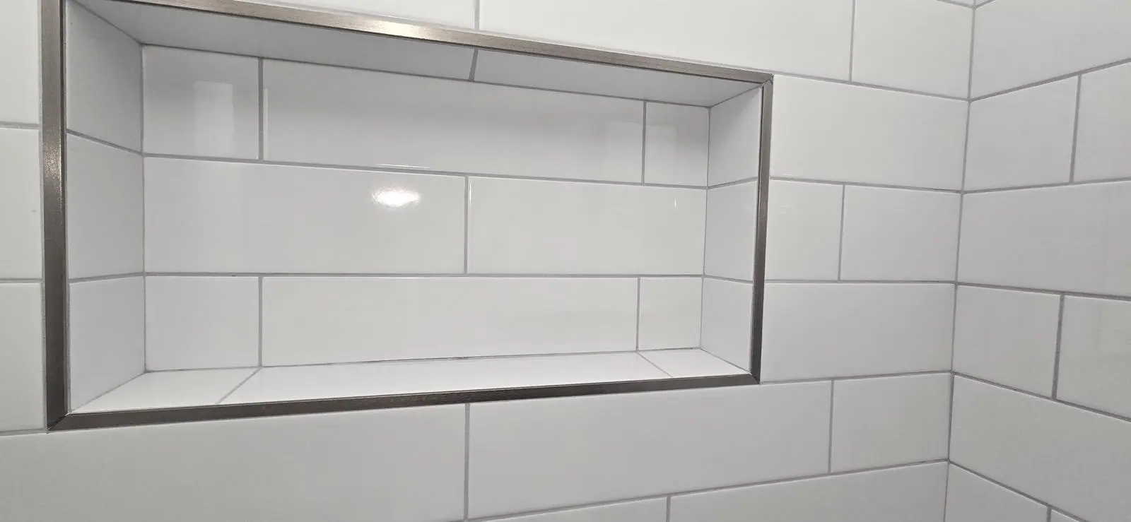
Grout close to the tile color lets the surface read as one plane. It works well with large-format tile, veined or marble-look tile, and rooms where the tile works as a backdrop.
Contrasting grout: the pattern becomes the design
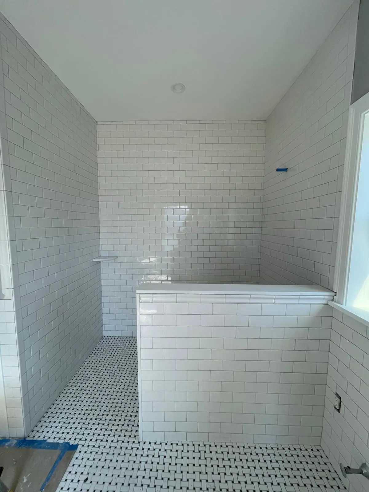
A darker grout with light tile, or the reverse, outlines every piece. That emphasizes layouts like subway, herringbone or square grids. Because every joint is visible, it also puts more attention on how straight and consistent the installation is.
Questions to ask before deciding
- Is the tile the feature, or is the layout the feature?
- How will the grout look next to the fixtures, vanity and trim finish?
- Will this surface be a floor or a wall? Floors see more wear and dirt.
- Do you want a sample board to see the tile and grout together in the room's light?
Patterned tile needs a different approach
With graphic or encaustic-style patterns, the print already carries the design. A neutral grout that sits between the tile colors usually keeps the pattern reading as one continuous design.
Choosing tile for a new project? ED'S Tile & Floors can help you think through layout and finish.